Overview
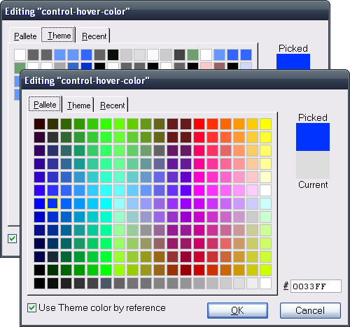
The Color Picker is a tool for editing color values. It provides multiple methods for selecting a color value, including the Palette tab with more than 200 pre-defined colors, the Theme tab with the colors defined in the current Theme, and a tab that lists recently-used colors.

Like the HTML Editor and the Text Editor, you can open the Color Picker by clicking on the textbox of a color property and selecting Edit > Open Editor... or pressing the F7 function key.
When the Color Picker opens, the Picked and Current colors shown on the upper-right of the Color Picker window are set to the color of the property being edited. If you have specified a color using one of the color names that Second Site recognizes, Second Site will convert the color name into a color value. When you click a color, the Picked color will change to that color.
The CSS color code of the Picked color is shown in the textbox on the lower-right. You may key a CSS color code to change the Picked color. You may also paste a CSS color code into the textbox.
The color choices on each tab work similarly. You can select a color by clicking it. If you hover over a color, a tooltip will appear to indicate the CSS color code. When you click on a color, the Picked color changes to that color.
When you click a color, the Color Picker assigns a thick border to your choice. If the same color appears on the same tab or on different tabs, all the instances of the color will have a thick border.
Click the [OK] button to close the Color Picker and set the current color property to the Picked color. Click the [Cancel] button to close the Color Picker and leave the color property unchanged.
Palette Tab
The Palette tab is always available. It includes 216 colors, and similar colors are close to each other. The bottom row has 18 shades of gray ranging from full black on the left to full white on the right. Some of the shades of gray that appear in the bottom row also appear in one of the rows above, and clicking one of those colors will highlight two boxes.
Theme Tab
The Theme tab lists the colors used in the current Theme, and is a shortcut for picking a color that is defined in the Theme section.
If the current color property can contain a reference to a Theme color, the Use Theme color by reference checkbox will be enabled. If you select a color from the Theme tab, and Use Theme color by reference is checked, the color property will be set to a text value that refers to the selected Theme color. An example reference value is theme:backcolor.border-color. When Second Site writes the property to the CSS file, it will use the color defined in the border-color property of the Theme.Colors, Backgrounds section. ("backcolor" is the "rule code" that identifies the section and is visible in the Rule Code property of the section.)
The same color may appear multiple times on the Theme tab because a single color is often used for more than one Theme property. Use the tooltips to determine which of those colors to select to link the value of the current property to a specific Theme property value. Theme colors are listed by section in this sequence:
| Section Name | Rule Code |
|---|---|
| Colors, Backgrounds | backcolor |
| Menu | menu |
| Charts | chart |
| Slideshows | slideshow |
If the current Theme includes a Theme-specific style section, those color properties will appear last.
You must select a color on the Theme tab to set the color to a reference value. If you select the same color on one of the other tabs, the CSS code will be inserted into the property value.
Recent Tab
The Recent tab lists the colors selected in prior uses of the Color Picker.
This page last changed on 05 Feb 2016.